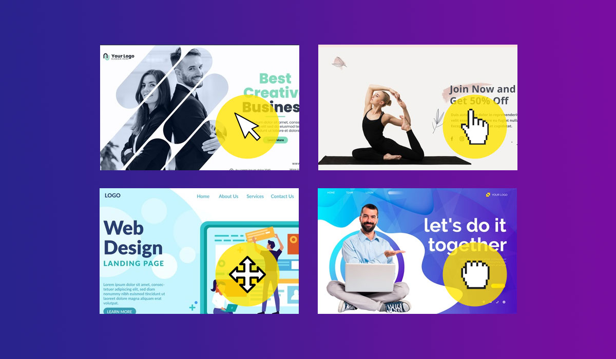
Manipulating your cursor to enhance the overall experience of your web can really be a game changer. This is because your cursor is something that cannot be overlooked or avoided while using a website, hence the more efficient and user-friendly your cursor is, the better image it establishes for your web site. Usually when you include an additional feature to your site, there is a probability that the user might not stumble upon this feature and your investment might go to waste, but that will never be the case with cursor effects.
Updating your cursor is a good way of keeping in line with the forever evolving nature of the internet and maximizing on the latest trends. Every time a new mouse related trend makes its way to the top, website owners should see it as an opportunity that cannot be missed. Don’t get worried or discouraged by the small size of your cursor, using the right effects can really do wonders for your company’s reputation by enhancing user experience and establishing your image as a tech savvy brand. You are probably wondering what you can do to make your website inclusive of different cursor effects then you are in the right place. We have compiled a list of the different cursor effects that have been opted by different websites, that might help in spurring up some ideas in your brain which might prove beneficial for you and your web.
1. A STORY ABOUT TRUST.
This was a web experiment designed to increase the level of playfulness and comfort that the website brings to the table. Upon visiting the website, the user comes face to face with nothing but a black screen and a tiny cursor in the shape of a circle. This circle intrigues the user to explore more and uncover the hidden website behind the black screen.
This is also good for the website because it gives the server a few seconds to gear up and assemble everything for the user before the actual page is loaded.
2. FLIXXO
Flixxo has altered its cursor in a unique way to match the content of their website. The website itself is made for the purposes of distributing videos and the cursor has been genuinely crafted in the shape of a triangle to represent the play button that is found in videos. Initially, the effect did not make a huge difference as the triangle blended with the background of the website. However, Flixxo adapted to this problem by embedding this triangle inside a yellow-colored circle. The yellow color pops on the screen and makes it super convenient for the user to spot their cursor.
3. BLKOUT
BLKOUT uses a white hollow circle that follows its cursor. If you visit BLKOUT, you will find that the homepage itself is very overwhelming and has a lot of other visuals that can be a cause of distraction for the user which might bring you under the assumption that it won’t be easy to spot the cursor and you will have to scan the entire page with your eyes just to locate your cursor. This is not the case though, the white ring that follows your cursor immediately catches your attention and makes it a hard-to-miss feature. The ring that tags along with your mouse also gives the whole experience a playful touch.
4. YUKIE NAIL NEW YORK
Yukie nail New York is a salon and day spa located in the middle of Manhattan. This fast-running spa has made its presence in the virtual world too. When a user visits their website, upon navigation, the user discovers that the cursor comes with a ripple effect. Whatever direction you move your cursor in, it leave behind little ripples, giving the background a live water effect. This adds a touch of creativity and playfulness to the over all experience of the website as the cursor is allowed to interact with the display.
5. DENTON DESIGN
Denton design or Nate Denton Design, as the name suggests, offers designing services in different domains. When you load the website, the first thing you’ll see is a white egg, that gets filled up by pink color as the website loads in the background. The most eye-catching feature of the site is the image of the rooster that appears on the center of the page. The cursor, in keeping with the theme of the site, is shaped as a pink dot that is followed by a white egg that is trying to catch the cursor. This adds to a fun experience for the user as it is a shift away from the monotonous nature of browsing through different sites with a plain cursor.
6. SARTO BIKES
The team behind Sarto Bikes has come up with an ingenious solution to stay on top of the game as far as cursors are concerned. Their cursor comes in two shapes. The first one appears in the shape of a circle that says “click to enter” and once you right click on any part of the screen, the cursor shifts to a colored diamond. The diamond comes in two colors i.e., black and white, and the color of the diamond is programmed in such a way that it always stands in contrast to the background. For instance, if the background is white then the cursor is black and vice versa.
CONCLUSION
Altering the design of your mouse will have a positive effect on the communication between the user interface and the user themselves. Using a unique and innovative cursor design can improve your website by a milestone as it keeps the user entertained and involved in your site while simultaneously giving you enough page to load your data smoothly. Our only advice would be to keep yourself aware of all the hot trends in the market and view the developers’ community as competition since they are always finding original and inimitable ways to make their websites stand out.


Leave a Comment