The best websites are customer-oriented. They are structured to offer details to guests searching for and displaying it in an interesting, coordinated manner. They let the consumer see the authentic you that creates confidence. This makes it easy for users to accomplish any action they have in mind, whether it’s purchasing a product, subscribing to a newsletter, or contacting you for further information.
If you divert attention or annoy the people, they either need some more time to find what they came up with, or they might overlook their original target altogether. Anyway, they’re not going to perceive the site as user-friendly, and they’re likely to leave disappointed and have no hope of coming back.
Visitors are going to your platform with certain ambitions in mind. Your task is to assist them to accomplish these goals as efficiently as possible, making sure that they have a good user experience or UX, as it is widely called. The simple truth is that your followers don’t want it stylish or smart. They’re not going to take the time to decode your language. They just want to hear how you’re going to fix their dilemma. Or, look at it another way, what are you offering, and why is that good for them?
Here are some proven and tested tips to help make your website user-friendly and effective:
BEGIN WITH A BASIC LAYOUT PLAN:
Arrange the pages into simply labeled sections and use common words on your list. Users don’t want to wonder where they’re headed. They don’t want to discuss what you’re talking about. And they’re not patient enough to go on a journey of discovery for details.
ADAPT BEST SEO STRATEGIES:
The best website on the Internet is a failure if nobody can find it. If Google rates your website high by using optimized copying, you’ll instantly get a great deal of attention from prospects looking for your item or brand. Correct search engine optimization offers a big return on investment.
USE COMMUNICATIVE ENGLISH:
No one likes to read content that looks like a term paper, regardless of what your college English professor may have assumed. Create a document as if you were referring explicitly to the audience. Pretend like you’re holding a one-on-one chat. Using a second party like “you” and “we.” A pleasant, casual tone is stronger than a firm, corporate-speak. Contractions like “you’ll” and “we’re” are all correct.
PROVIDE ALL THE IMPORTANT CONTENT:
When viewers browse the internet, they’re searching for answers. If your platform fails to have the facts, the user will switch to the next one of the search engines results. Don’t be scared to share too much, and that involves prices. Clarity is working. Studies suggest that information-rich sites are the most successful at turning users into real possibilities. And search algorithms prefer sites that offer detailed information, rating them higher than fragmented sites that lack topic coverage.
WORK ON YOUR HOMEPAGE:
Because your home page is the most popular gateway to your site, you can explain how visitors will profit from your information, goods, or services. If people can’t easily find out what’s in it for them, they’ll press the return button. Bam, gone already!
On your home page, have links to three to four inner pages that people usually look for. They could be to the About Us page or Q/A pages or a link to your top-selling product list. These ties can continue to attract customers and capture their attention.
BUILD INNOVATIVE LANDING PAGES FOR SEPARATE TOPICS:
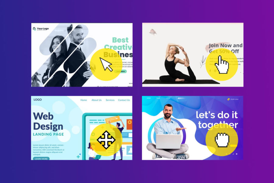
Although you might want people to get in the front entrance, the home page of your site, it might not be the right plan. A more focused solution is to build landing pages that talk to particular topics. If anyone is searching for details about the specific purpose of your product, they can land on your dedicated website. Landing pages are converted at a faster rate than home pages.
If you are interested in approaching vertical markets, create a different landing page for each sector. Not only can you receive more web users, but you can also see a spike in conversions, that is, visitors being eligible leads and clients.
KEEP UPDATING YOUR WEBSITE:
If visitors find that your material is not up-to-date, your platform will lose all reputation. Continuously upgrade the site, incorporate more to it, and delete any content that is outdated. The last part of the statement is important, so We pray you haven’t skipped it. You’re not only going to add stuff. You will need to remove something that is no longer important. If the appropriate details are hidden, the visitor will never discover them.
USE A SIMPLE AND CLEAN STRUCTURE:
No one likes the clutter, and that means guests to your site. Clean, easy, and well-structured work is the finest. The more straightforward, the better, the easier it is for people to find what they want and need. Clean and easy shall also refer to the programming of your web. If you want to conquer search engines, employ an experienced website builder who specializes in designing clean code websites, and pays much attention to site loading speed and efficiency.
If you’re going to do the layout yourself, try using a site designer like Weebly, Squarespace, or Craft. Website designers remove the need to employ a programmer or learn how to code.
CONCLUSION:
Visitors to your webpage are expected to be anxious in a modern information-saturated environment. If they can’t locate what they want easily, they’re going to move on. They’re cynical of something that sounds “promotional.” If they could relate to you, they’d say, “Only the truth, thanks.” Your site must offer true value to be successful. Place the needs of your customers in the first place as you build their content and observe your conversion rate increase!
We hope our tried and tested tips help you tremendously to make your website successful and reach heights in a short period.


Leave a Comment