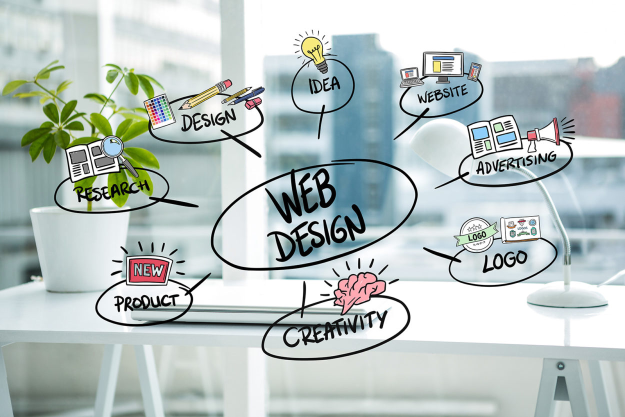
Web development strategies are everywhere all over the internet. A lot of people have ideas about what the right website looks like. That’s because, to some degree, the structure is arbitrary. If one person enjoys it, another person may find it disgusting. Around the same time, web design is one of the most significant considerations in the growth of the website. In reality, almost half of the people state that the layout of a website is their key consideration in determining the reputation of an organization. As a result, it also impacts converts, bounce rates, and much more.
So, if there was only one way to get reliable evidence on how to build a strong web template. Wait a minute, there is! And in this post, a lot of it has been collected. Stay on the website for some web design tips supported by studies and research. Avoid depending on your gut instinct and start trying stuff that has been shown to work.
BEST WEB DESIGN TIPS TO FOLLOW RIGHT NOW:
In the following, you’ll find some study-based tips and tricks about how to enhance your website design.
MAKE THE WEBSITE SPEED YOUR TOP PRIORITY:
It is perhaps one of the least discussed realities in the web design field that pace is critical. Analysis has shown us that affects everything from organic traffic over service quality to conversion and sales.
If your site is sluggish, users are not going to hang around. Period. Plus, since consumers think about it, search engines often do and weigh the speed of your page launching into their scores. That’s why you must invest in having your website work as rapidly as possible.
TAKE ADVANTAGE OF THE FOLD:
A fold is still indeed a part of a heated discussion. Some people claim that because of the plethora of screen dimensions these days, the fold does not exist anymore. Others take a different perspective. Even so, the reality is that people spend 57% of their time on top of the fold with a sudden drop after. 74% of their time has been spent on the first two screen grabs. So, the fold seems to always matter. For your site, this means that you’ll need to focus on your posts and use the free capacity to hook visitors to continue to do so. Here are a few tips on how to do this:
USE A SIMPLE AND INFORMATIVE HEADLINE: Explain what the platform will do for users, and illustrate the advantages. Be concise and use the language of influence. Be concise and use the language of influence.
HAVE YOUR KEY CALL TO ACTION: To boost your odds of converting, the fold is the time to launch a user’s path. Made sure that the CTA is consistent and noticeable.
INCLUDE VISUALS Including Images, clips, or audio helps to highlight the point. Below, we’ll learn much about visual stuff.
Hick’s Law says that the more options a person has, the longer they take to come to a decision. There is an interesting analysis of this practice, in which customers in the store were offered more or fewer types of jam to choose from. In the end, people who have had more options were much less likely to be found purchasing a jar than those who had the fewer range to pick from.
How relevant is it to your webpage? That you may be able to improve your conversions easily by restricting the option you make to customers. Here are some descriptions of what this could look like:
- Decrease the amount of item on the list
- Rely on one call for action
- Just show social icons for platforms on which you are involved
- Stick to one target per section.
KEEP IT CLEAN AND BASIC:
Pursuing the lesser theme, this also refers to the overall style. Google’s massive research has found that users don’t like visual sophistication. The basic idea: the more intricate your style, the less attractive it is viewed by people. What does this imply for your blog?
Reconsider the sidebar. More and more sites are avoiding the sidebar in favor of a single-column style. It means fewer disturbances and simply emphasizes the material. Maintain using Traditional Layouts. People enjoy consistency and can get upset about non-standard web templates. It could also be a smart choice to adhere to common style themes and formats. You will also find opportunities to pop out in a particular way.
MENTION THE CORRECT LISTING ORDER:
Using lists, both arranged and unsorted is a perfect way to make details more available. It works out, though, that here, too, there’s a lot of human interest. This is attributed to the so-called serial position influence. It means that you’re better at remembering all the things at the start and the end of the list. The middle segment, on the contrary, is largely overlooked.
The moral here: whenever you mention the features of your item or brand, ensure you keep the most relevant where they are likely to affect users.
USE THE INFLUENCE OF SOCIAL EVIDENCE:
The last tip of our website development is about the so-called adherence tendency. This is the urge of individuals to do as everyone does. That indicates, if several humans agree on something, others are more inclined to do the exact thing. One way to make the most of this on your site is to provide social evidence. If you can demonstrate that people have a favorable view of your web, material, product, or service, potential users are more inclined to do the same. You can more readily demonstrate this with collections of social shares, media statements, and/or reviews.
CONCLUSION:
Web design is a dynamic subject and a component with a great deal of impact on the performance of the site. It’s better to know what you’re doing for that purpose. It is a smart way of ensuring that you focus on research for guidance. The above strategies could be used to make your websites more successful, to better satisfy your users, and to increase the conversion and other performance marks of your web.


Leave a Comment